In the era of big data, the capacity to make sense of vast and intricate data sets is of paramount importance. As the volume of information generated and collected grows exponentially, data visualisation has emerged as a powerful tool for decoding the complexities of data, facilitating comprehension and decision-making. At its core, data visualisation refers to the use of graphical representations, such as charts, graphs, maps, and other visualisations, to help users understand and interpret complex data sets. In this article, we explore the significance of data visualisation, its varied techniques, and its indispensable role in decision-making across various domains.
The Significance of Data Visualisation
- Comprehending Complex Data: The human brain processes visual information far more efficiently than textual or numeric data. Data visualisation leverages this inherent ability by presenting data in a graphical format, making it easier to identify patterns, trends, and correlations that might go unnoticed in traditional spreadsheets or reports.
- Facilitating Decision-Making: Data-driven decisions are pivotal in today’s competitive business landscape. Data visualisation tools enable stakeholders to quickly grasp the implications of data analysis, allowing them to make informed decisions and act swiftly.
- Enhancing Communication: Visual representations of data can effectively communicate complex ideas and information to a diverse audience. By simplifying data into digestible visual formats, data visualisation fosters collaboration and understanding among teams and stakeholders.
Data Visualisation Techniques
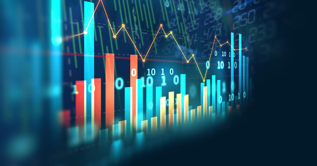
- Charts and Graphs: The most common form of data visualisation, charts and graphs, are used to represent data in a structured format. Some popular types include bar charts, pie charts, line charts, and scatter plots. These visualisations are particularly helpful in highlighting trends, comparisons, and relationships among data points.
- Maps: Geographic data can be effectively visualised using maps, which enable users to comprehend spatial relationships and patterns. Choropleth maps, heat maps, and cartograms are a few examples of map-based visualisations.
- Infographics: Infographics combine visuals, text, and data to convey complex information in a simplified and engaging manner. They are particularly effective in communicating key insights, statistics, or comparisons in a visually appealing and easily digestible format.
- Dashboards: Dashboards are customisable interfaces that display multiple visualisations and data points in a consolidated view. They facilitate real-time monitoring, analysis, and decision-making, offering users a comprehensive snapshot of key performance indicators and trends.
- Interactive Visualisations: Interactive visualisations allow users to manipulate data and explore different scenarios or perspectives. By offering a more immersive and engaging experience, interactive visualisations promote deeper understanding and insight.
The Role of Data Visualisation in Decision-Making
- Business Intelligence: Data visualisation plays a crucial role in business intelligence by transforming raw data into actionable insights. Companies use visualisations to track key performance indicators, monitor trends, and identify areas for improvement, driving growth and profitability.
- Public Policy: In the realm of public policy, data visualisation assists policymakers in understanding the implications of policy decisions, identifying trends, and monitoring progress. Visual representations of data can also foster public engagement and awareness around pressing issues.
- Healthcare: Data visualisation is increasingly being used in healthcare to monitor and analyse patient data, track disease outbreaks, and identify trends in public health. By providing a clear visual representation of complex data, visualisations can aid medical professionals in making informed decisions and improving patient outcomes.
- Research and Academia: In research and academia, data visualisation tools are instrumental in representing complex research findings, enabling researchers to identify trends, correlations, and anomalies. Visualisations can also enhance the communication and dissemination of research findings to a broader audience, fostering greater understanding and collaboration.
- Financial Services: In the financial sector, data visualisation is employed to track market trends, monitor portfolio performance, and analyse risk factors. Visual representations of financial data enable investors and analysts to make informed decisions and develop robust investment strategies.
- Environmental Sciences: Data visualisation plays a vital role in environmental sciences, helping researchers and policymakers to understand and address critical issues such as climate change, deforestation, and pollution. Visualisations can also be used to raise public awareness and encourage sustainable practices.
- Sports Analytics: In the realm of sports analytics, data visualisation helps coaches, players, and analysts to make data-driven decisions by providing insights into player performance, game strategies, and injury prevention. Visualisations can also be used to enhance fan engagement and improve the overall spectator experience.
- Urban Planning: Data visualisation is a valuable asset in urban planning and development, enabling planners and decision-makers to make informed choices regarding land use, transportation, and infrastructure. By providing a clear visual representation of complex data, such as population growth, traffic patterns, and resource allocation, visualisations help create sustainable and efficient urban environments.
- Education: In the field of education, data visualisation can be used to track student performance, identify areas for improvement, and develop targeted interventions. Visual representations of educational data can also be used to engage students and facilitate their understanding of complex concepts.
- Supply Chain Management: Data visualisation plays a crucial role in supply chain management, allowing companies to monitor and optimise their supply chain processes. By providing a clear visual representation of data, such as inventory levels, shipping routes, and lead times, visualisations enable organisations to make data-driven decisions, reduce costs, and improve efficiency.
- Human Resources: In human resources, data visualisation is employed to analyse workforce data, identify trends, and inform decision-making. Visual representations of data can help HR professionals track key performance indicators, such as employee retention, satisfaction, and productivity, enabling them to develop targeted strategies for talent management and organisational growth.
Challenges and Best Practices in Data Visualisation
Despite its numerous benefits, data visualisation also presents challenges, particularly in terms of accuracy, design, and accessibility. To maximise the effectiveness of data visualisation, it is essential to adhere to best practices.
- Accuracy: Ensuring the accuracy of data visualisations is critical, as misleading or incorrect representations can lead to misguided decisions. Data should be thoroughly cleaned, validated, and contextualised to avoid errors and misinterpretations.
- Clarity: Effective data visualisations should be clear, concise, and easily interpretable. To achieve this, it is important to select the appropriate visualisation technique, limit the use of visual elements, and ensure that the design aligns with the data’s purpose and context.
- Accessibility: Data visualisations should be accessible to a diverse audience, taking into consideration factors such as colour blindness, cognitive abilities, and cultural differences. Designers should strive to create inclusive visualisations that are easily understood by all users.
- Interactivity: Providing interactivity in data visualisations can enhance user engagement and promote deeper understanding of the data. By allowing users to explore the data from different perspectives, interactive visualisations can reveal hidden insights and foster a more nuanced interpretation of the data.
Summary
In summary, data visualisation is an essential tool for making sense of complex data sets, guiding decision-making, and enhancing communication across a wide range of domains. By adhering to best practices and leveraging advancements in technology, individuals and organisations can unlock the full potential of data visualisation, harnessing the power of data to drive innovation, growth, and success in the information age.